EUR
EUR USD
USD JPY
JPY GBP
GBP CNY
CNYOffice Aesthetics: How Color Psychology Influences Focus and Mood

The color of an office is rarely a choice one truly reflects on. Yet, it can influence the atmosphere of a workspace, our perception of the environment, and how we stay focused throughout the day more than one might imagine.
Color psychology is not a magic formula, and it will never replace a good chair, proper lighting, or a well-organized desk. But color is a simple and inexpensive way to change the ambiance of a workspace. Some research suggests that colors can influence motivation and cognitive performance depending on the type of task.
So, what color should you choose for your office? There is no perfect color for everyone. The best choice depends instead on the desired atmosphere and the type of work performed.
Blue: A Basis for Concentration
Blue is often associated with calm and concentration, but its effect on performance also depends on the nature of the task. A study published in Science notably showed that blue could foster creative performance, while red could improve certain tasks more oriented towards detail.
For a space dedicated to creative work, reflection, or long periods of concentration, a palette dominated by soft blues can therefore be an interesting basis.
It's not necessary to repaint the entire office. A blue desk pad, a navy organizer, or a lamp with cool tones can be enough to introduce this color without completely transforming the room.
Green: A Touch of Nature for a Break
Green is naturally associated with outdoor environments. This relationship with nature can be particularly interesting in a space where one spends long hours.
Research on the effects of nature on attention suggests that contact with natural environments can help restore directed attention after a period of mental fatigue.
On a desk, this idea can be applied very simply: a plant, a green notebook, or a touch of sage green can provide a soothing visual presence and create a breathing point during breaks.
Green doesn't need to dominate the space. A single touch can be enough.
Yellow: A Touch of Energy, with Moderation
Yellow is generally perceived as bright, energetic, and optimistic. In an office, a small touch of yellow can add contrast to a very neutral palette and give the space more character.
But a bright color doesn't need to occupy the entire room to be noticed.
Instead, use yellow as an accent color: a cup, a pen holder, a notebook, or a small object placed on the desk. The goal is to bring a little visual energy without creating an overly stimulating environment.
Red: For Tasks Requiring Precision
Red is probably the color that deserves the most restraint in a workspace.
Research on color and cognitive performance shows that red can favor certain detail-oriented tasks, while blue can be more favorable to creative tasks. However, these effects vary depending on the nature and difficulty of the work.
For this reason, red can work as an accent color in a space intended for proofreading, verification, or other tasks requiring particular attention to detail.
However, it is rarely necessary to make it the dominant color of an office designed to remain calm for several hours.
Neutral Tones: A Simple Base, but Not Necessarily Sufficient
White, gray, beige, and other neutral tones easily give the office a clean, sober, and tidy appearance.
They provide an excellent base, but an entirely neutral space can also lack visual contrast or character.
The solution is not to add many colors. One or two well-chosen touches are usually enough to give more depth to the whole.
A beige or white office can, for example, welcome a blue element to create an atmosphere conducive to concentration, a plant to bring a touch of green, and a small warmer accent to create contrast.

How to Use Color Psychology Without Redoing Your Entire Office
The goal is not to create a perfectly calculated palette. It's simply about making more intentional choices.
A simple approach can be to:
- choose a neutral or blue base to create a stable atmosphere;
- add a green element, such as a plant or a notebook, to bring a natural and soothing touch;
- use a small touch of yellow to introduce visual energy;
- reserve red for small accents when the work requires more precision;
- avoid placing too many bright colors directly in the field of vision.
The principle is simple: color should accompany the office, and not become an additional distraction.
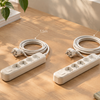
But the aesthetic of an office is not limited to colors. Functional objects also contribute to the visual balance of the space. A power strip placed on the floor, surrounded by cables and adapters, can quickly create a sense of clutter, even when the rest of the office is carefully organized. Conversely, a European power strip designed to remain visible on the desk can group essential connections while integrating more naturally into the work environment.
The Monday office ritual naturally fits into this approach. A calm, orderly, and intentional space facilitates the creation of a morning routine and allows the office to become a true signal of transition to work.
The Best Color for an Office is the One That Suits Your Way of Working
Color psychology is not about finding a universally better color than others.
Blue can be interesting for an environment oriented towards creativity and concentration. Green can bring a natural presence and a sense of space. Yellow can serve as a small energizing touch, while red can be used sparingly when precision is important. Neutral tones can finally serve as a backdrop to keep everything calm and balanced.
Color is one of the simplest changes to make to an office. It requires no new equipment or complete rearrangement. A single object, a new lamp, or a different desk pad can sometimes be enough to change the overall feel of a space.
A well-designed office does not seek to constantly attract attention. Instead, it creates an environment in which attention can remain where it needs to be.
MiaoLab Living designs everyday objects that naturally integrate into these small rituals, from a cup that helps maintain a drink at a pleasant temperature to details that make a workspace more thoughtful and comfortable.